BURGERKILL
La Murga was asked to start from a type to create a symbol for the restaurant visual identity, thats when we started creating everything and we’ve been in charge of developing the BurgerKill communication since the beggining.
They decided to let us give the restaurant a fresh ‘look n feel’, thanks for that!.
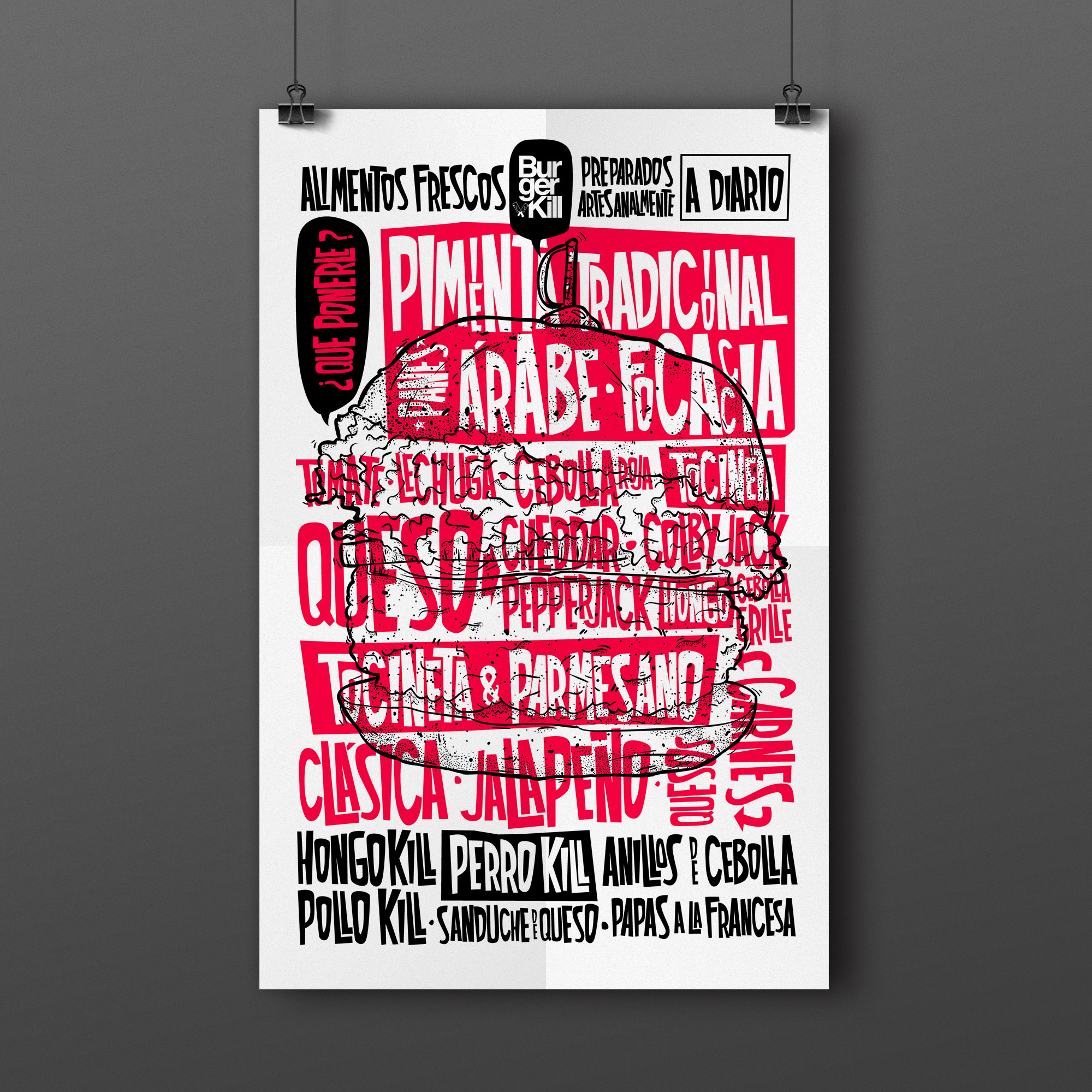
Pattern for the waxed paper that is served with the hamburgers.


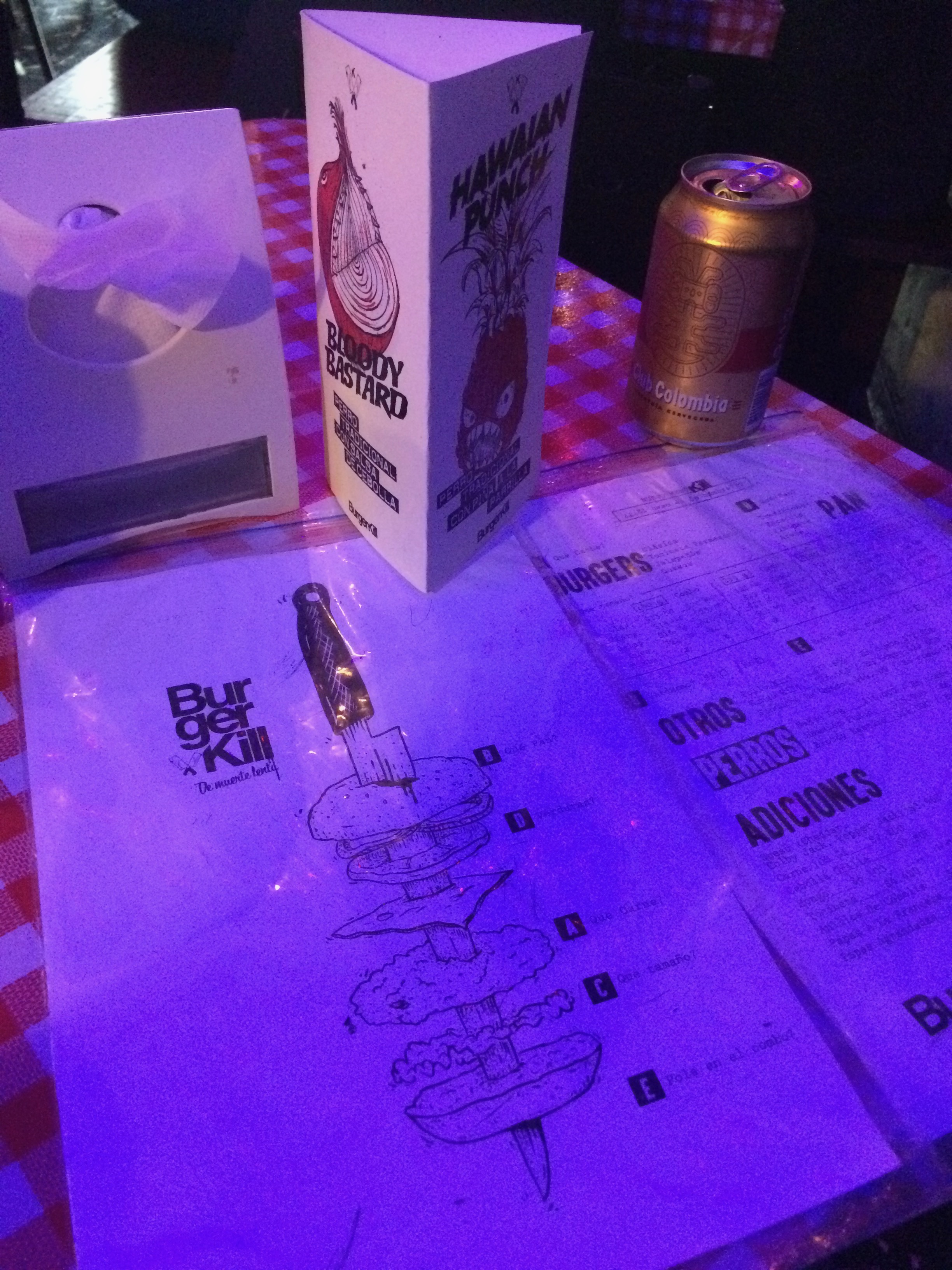
New menu design, inspired in the evidence bags in police investigations, as a reminder of the ‘Kill’ concept.
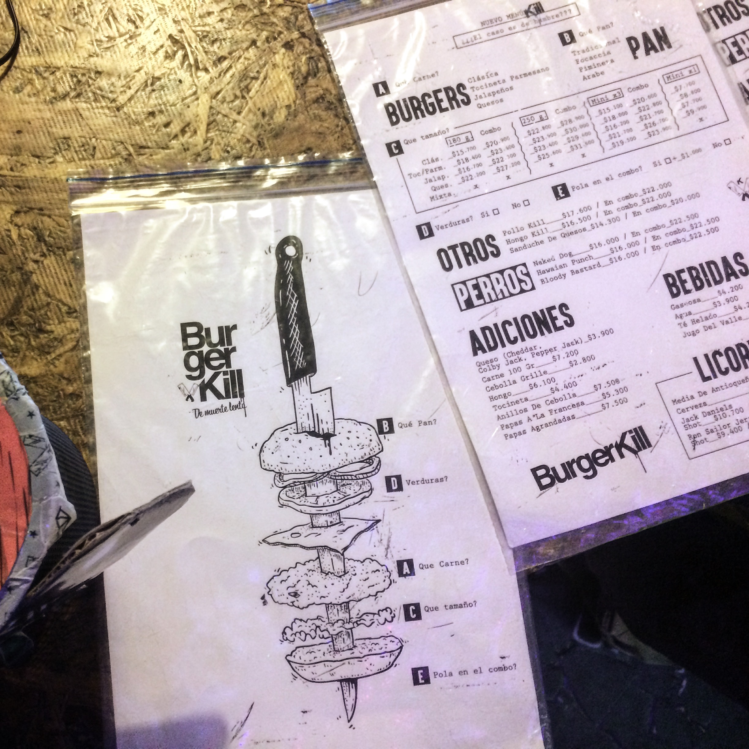
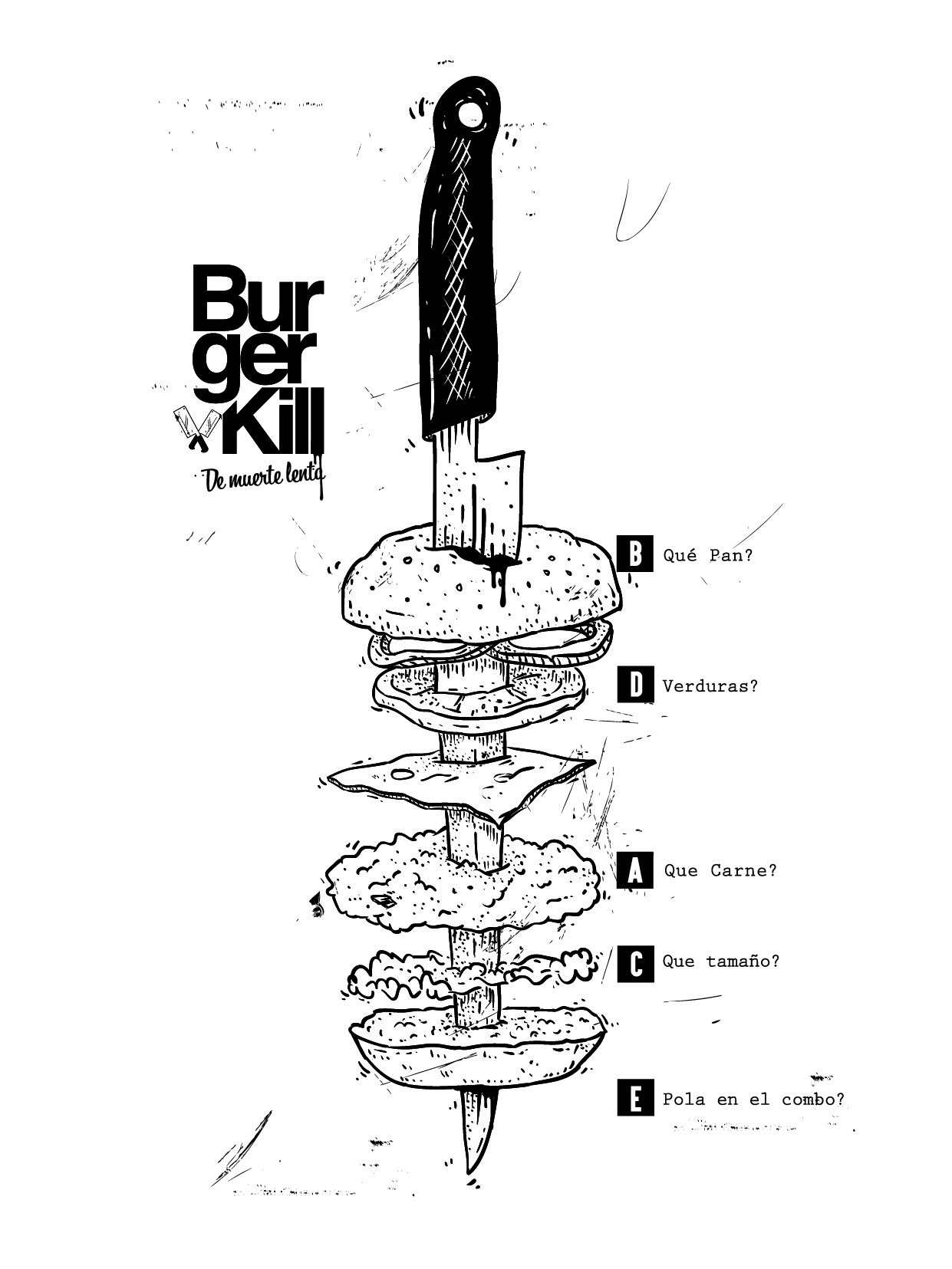

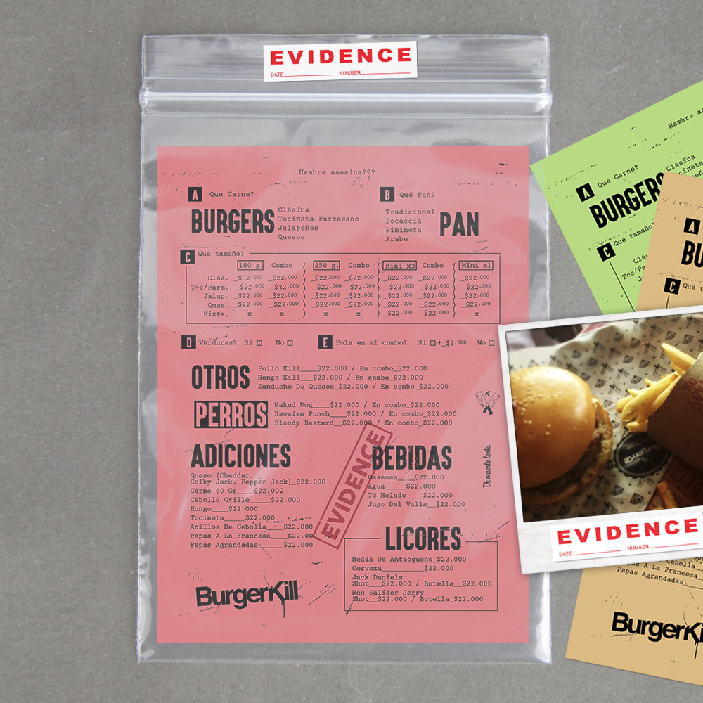
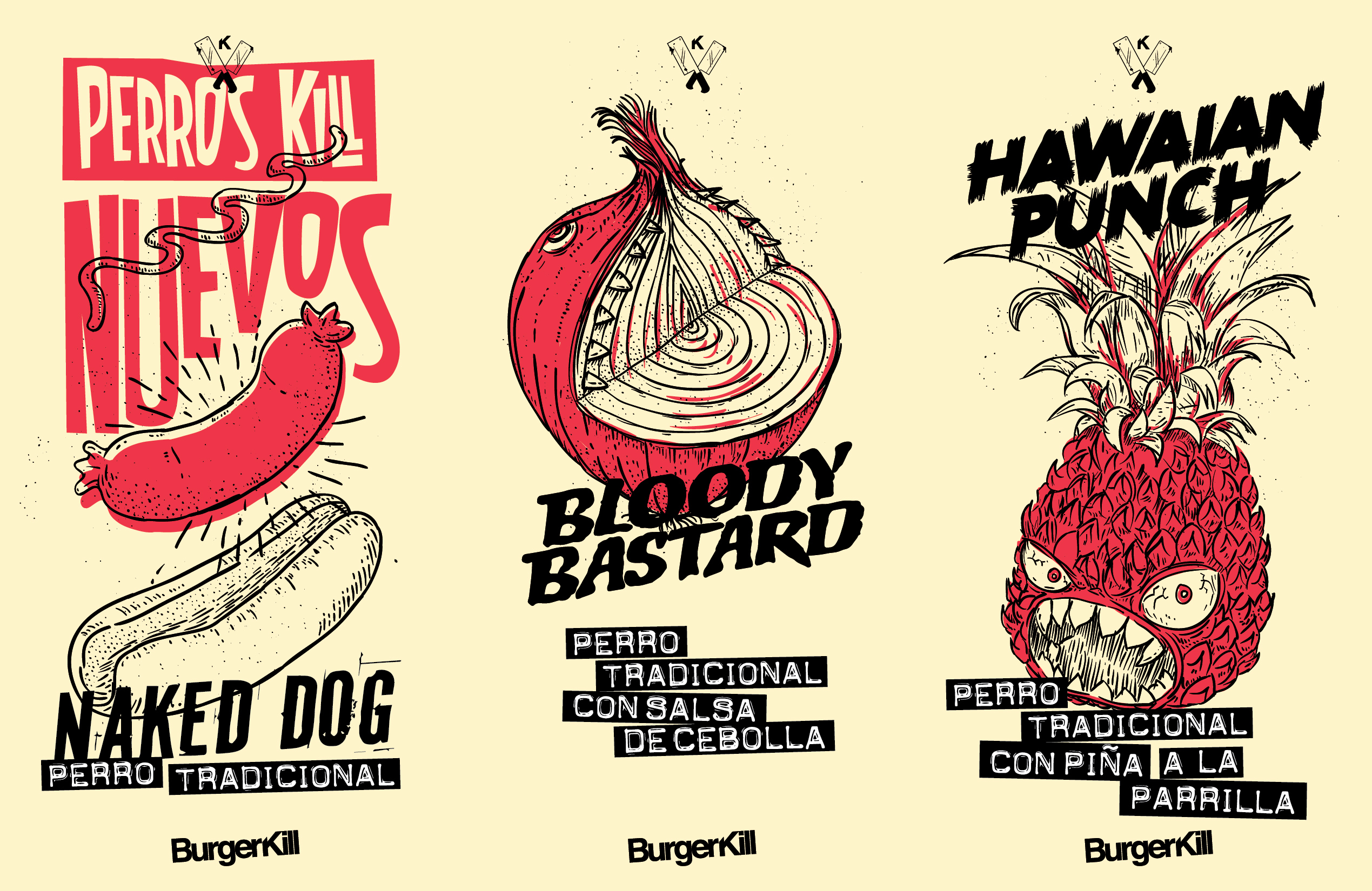
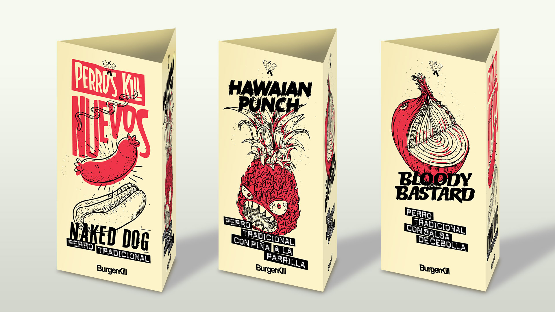
They needed the consumers to know about the new hot dogs Perros Kill, so they came up with some great names and La Murga created a few illustrations and we put them in a small devide right on the tables.
![]()
︎︎
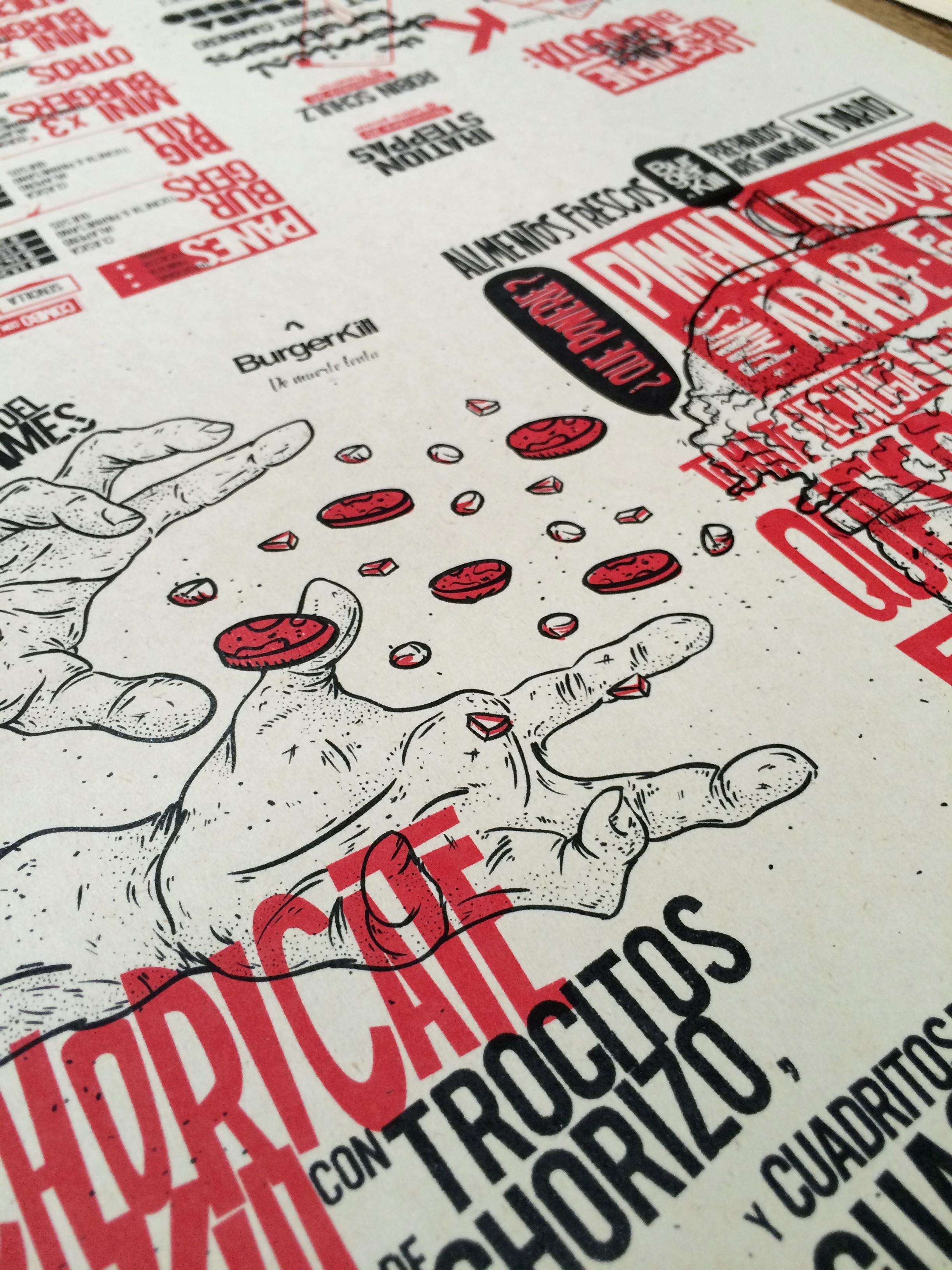
A small fanzine BurgerKill wanted to do that work as a reunion of the best musical events in Bogotá on that month, we came up with a folded poster with all the information that we wanted people to see, and it was also collectable and free distributed. Long live live music.


This was and idea for the website design that was on construction, for the people to see the imaginary world of the restaurant, a collage of stuff that give power to the brand, rock n’ roll, fashion, and a street visual vocabulary.

